Abstract
\ ab-ˌstrakt \
Abstract art uses visual language of shape, form, color and line to create a composition which may exist
with a degree of independence from visual references in the world.
\ ab-ˌstrakt \
Abstract art uses visual language of shape, form, color and line to create a composition which may exist
with a degree of independence from visual references in the world.
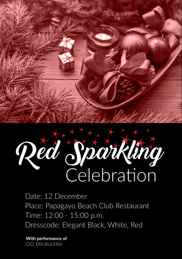
We used imagery with christmas balls with glitters and sparkling objects the main theme we used a logotype treatment with stars in random order above the lettertype to suggest sparkling, the font choice was an playful type which represents the light and an elegant type which represents celebration since the venue was at an 4 star hotel the combination worked fine for the client.
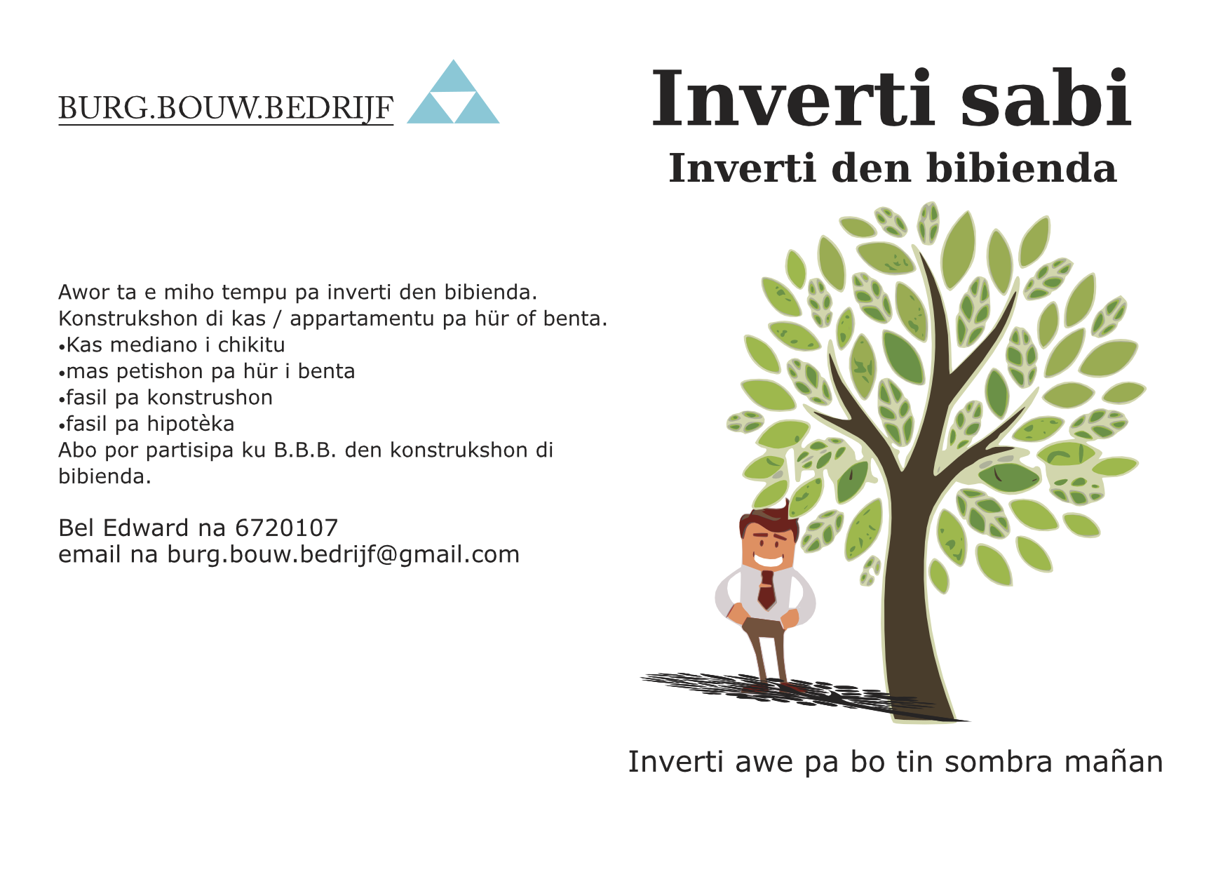
We choose a playful approach to the brochure where we use a tree as a methafor for investment since you have to plant a tree and maintain it for it to grow and the fruits are the fruits it gives.
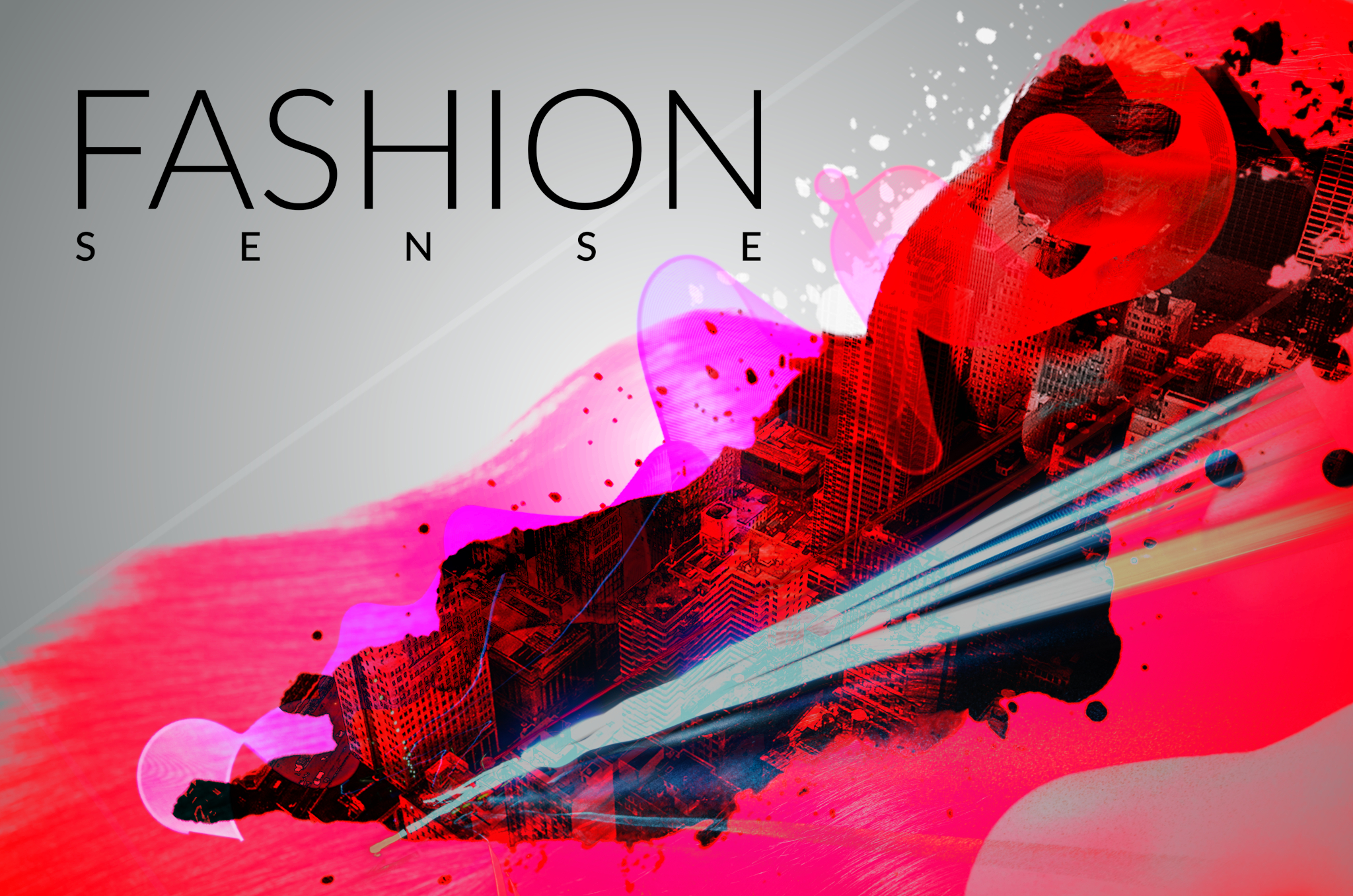
We went with a double exposuWe used stock imagery and a relax red/pink color to resemble the confort of home and active nature of exercise.The man disiplines are around the subject with a motivational message on the right.re look for the poster and bright neon colors. the type is a sleek sans-serif which gives it a elgent but modern feel to it all.
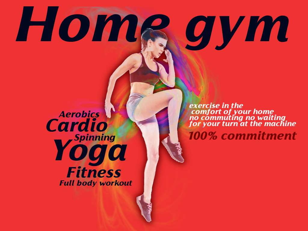
We used stock imagery and a relax red/pink color to resemble the confort of home and active nature of exercise.The man disiplines are around the subject with a motivational message on the right.
We redesigned the logo to resemble construction methods (foundation,rebar meshes etc).